Artists
Thea Kurun
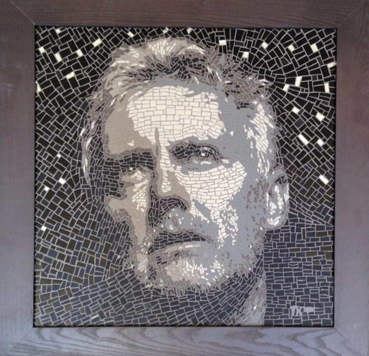
This South African graphic designer prepared an art mosaic with Roger’s face which was used as a cover for Fun on Earth.
-

- Original art mosaic by Thea Kurun
-

- Thea Kurun
Tim Mara Two Bar Electric Fire no. 1
The cover art for Roger’s album Electric Fire utilises a piece of art by Tim Mara, who Roger is a keen collector of. We have included for your interest some examples of Tim Mara’s work together with an essay written by Christopher Frayling.
Copyright Belinda Mara and Christopher Frayling 1998. Reproduced by kind permission of Belinda Mara and The Angela Flowers Gallery.
TIM MARA
‘A slightly obsessional printmaker’
 When Tim Mara’s screenprints of claustrophobic, cluttered interiors – a riot of patterns and colour, and a virtuoso demonstration of the art of printmaking – were first exhibited in New York in 1974, the critics tended to interpret them as pop art revisited: the main difference, they said, was that they featured Gold Flake packets and Dinky toys rather than Campbell’s soup cans. He was “humanizing Andy Warhol’s imagery for the purpose of dehumanizing it all over again”, wrote one, while another focused on the pop imagery of tabloid newspapers, consumer packaging and television sets. But, for Tim Mara, this was a superficial reading. His main purpose, he says, was to show that there was still life after all:
“I know that the pop thing was going on – screenprinting was there, photography was there, the everyday objects were there – but I was much more interested pictorially in Velasquez and Vermeer. Those prints had much more to do with painting. Just because I was using imagery which was contemporary and easily read, because I was trying to speak to the person who was looking at the picture, doesn’t mean that my prints were related to Richard Hamilton’s collages”.
Velasquez Las Meninas – with its complex web of visual clues, its inside-out mirror reflection of the King and Queen on the back wall, and above all it’s searching commentary on the processes of easel painting – was a key influence on Mara’s prints when he was studying at Wolverhampton polytechnic (1970-3) and the Royal College of Art (1973-6):
“The painting has the painter in it, and the back of the canvas as well. So it is about its own construction. And it is saying ‘this only a picture’ which helps the viewer to enter the pictorial language, to understand the conventions, and to be drawn into the artists world. I always seem to be referring to Las Meninas somewhere in my work”
VermeerÌs interiors – with their mixture of domestic details, clarity of light and stillness – were equally important to him. Only instead of using paint and a camera obscura (state of the art in the 1660’s), he used collaged black and white photographs and as many as fifty or sixty separately printed colours. An extremely elaborate way of going Dutch. Which led many critics to focus on his amazing technical skill and perfectionism, rather than on the design (in its true sense) which gave shape to them.
“In the hierarchy of fine art, printmaking is usually associated with craft skills – with technique. And that gets in the way. My work was always about the ideas more than the medium.”
So he prefers to see the prints which made his name – the Picnic Series and Portrait of Astrid made at Wolverhampton; Alan’s room, The Stage and Television Today and Power Cut Imminent made at the Royal College – as old masters in modern dress (“like a Shakespeare production in a contemporary setting”) and as storyboards for an avant-garde film he never really intended to make. A book on European cinema, wi th monochrome stills from Fellini and Antonioni films, was given to him when he was 15, and he still rates 8 1/2 as one of his desert island movies: frozen moments from stories he didn’t yet know, and the film about the making of a film “which constantly refers to the artist’s childhood”. The prints function at a narrative level – with the main story told in newspaper headlines, and countless sub-plots constructed out of visual components – and not far beneath the technicolor surface, at a conceptual level as well. Semiology was the latest line in haute culture in the 1970’s – hence, perhaps, the emphasis on mirrors, television screens, projectors, reflecting surfaces, facets, techniques of reproduction and how meaning is created through the language of signs. The researches of Richard Gregory into visual perception “a bit of arty science”, were also filtering into the studios (via photographs of dalmations standing in the snow, or of clouds which looked to some people like portraits of Jesus), and Tim Mara’s contemporaries as staff or students included Victor Burgin and John Stezaker.
“Their work intrigued me but I didn’t want to make dry conceptual pieces. I saw myself instead as a film-maker who also made prints. I didn’t want to draw or make a piece of work which relied on manual skill. When you make a film, you prepare the shots, shoot them and edit them but you never touch them – even though you are very involved emotionally and intellectually. I wanted to make pictures in the same way”.
But by the time he left the Royal College of Art in 1976, Tim Mara was beginning to move away from “stories which made sense within the picture” – his elaborate trademark screenprints were, he felt, beginning to pastiche themselves, he was attempting to cram too many ideas into them, not to mention the fact that the process of making was beginning to give him nosebleeds – towards multilayered explorations of texture and pattern: and toward individual images or pairs rather than collages. There was now less emphasis on elaborate planning, more on letting process and intuition take over. His best known print from this period is Self Portrait with Overcoat. Since in his narrative prints he had seldom shown people’s faces – whenever he was tempted to, he quickly obscured them with hands or crinkled bits of toffee wrapper or the sweep of a decoroller – this seemed to some an eccentric choice of subject. Faces, he said, distracted attention from the print and encouraged the viewer to think of the person as an individual which wasnÌt the point: faces were a shortcut to identity. “The narrative had been within the picture – not involved with character at all”, So his monochrome Self Portrait is about a Donegal tweed overcoat, or, to put it another way, about a “halftone dot coat”: the weave of the coat, photographed as it really was, appeared against a halftone of a garden; reading the print close up it was difficult to decipher where the coat ended and the garden began. They merged into one another. Most of the head was cut off by the top of the print.
“I bought this tweed coat and wore it a lot. People would recognise me from a distance because of that coat: clothes become characteristic of the person who is wearing them: they become part of the identity kit. The image was born out of my working with processes. When we start out, we make work related to our experiences of life. As we go on, our work is made from our experiences of work. And there was a painting reference in there as well. I’d been introduced to Francis Bacon, and I’d noticed his hands, his watch, the way he wore his sleeve pulled back. Then I happened to see a painting of his a couple of weeks later, and I immediately recognised those features in it. My coat was like that, in a way.
A rich mixture of association of ideas, visual resemblances, the language of images, details isolated from their usual context and a good joke – looking like those competitions where you reconstruct a painting from a tiny visual detail, printed out of scale. Towards the end of the 1980s, Tim Mara started making screenprints which juxtaposed two images – sometimes of everyday objects – on a matt black background. He wittily called them the Black Prints. A cutglass bowl beneath the galvanised coal scuttle: Coal and Diamonds.
 “They are at opposite ends of the object hierarchy, diamonds being condensed carbon at its most refined, coal at its crudest. A visual connection, and a fundamental connection. Also opposite ends of the social scale: the print was made during the minersÌ strike. I was dealing with less information by now “it’s not complex in the way it’s read: it is simply what it is”.
And what it is, is a clear-headed analysis of the appearance of galvanised steel and cut glass. Another print in the series shows a magnifying glass which looks like a cartoon character next to a toy cowboy on a horse: Helping Hands. The magnifying glass is holding a print made up of dots and shapes which on closer inspection turns out to be another horse and rider:
“Rupert Sheldrake was writing about his theory of morphic resonance at the time. The idea being that if a group of people in New York take a given amount of time to assimilate new information, then a similar group of people in London will understand the same information more quickly because it is somehow in the ether. The picture of the horse and rider is one of the test images he used. Not everyone can see what it is. I found the magnifying glass, which was called Îhelping handsÌ. That print is full of visual puzzles. ItÌs good if viewers see more in the print, the more they look at it. Maybe they only see the horse and rider when they get home”.
Like walking past Holbein’s Ambassadors in the National Gallery, and only realizing when you reach Charing Cross tube station that the shape in the foreground is really an anamorphic skull. More recent pairs of images have explored the look and feel of contrasting materials ( as in Can and Bowl 1992 – cannonball? – where the materials are weathered metal and green plastic), set against blocks of colour: green on burgundy, silver on black, with a thin blue line dividing them (“composed as an abstract painting”). Or they have explored questions of identity and difference. His two bulbous red plastic buckets on a green background look different – but they are in fact the same: two registrations of the same print (“an edition on the same piece of paper”). The one on the left looks the more bulbous of the two, the one on the right seems at a slightly different angle. “When they are up on the wall”, he says “you sometimes think it’s the other one…!” His current sketchbook is full of visual and verbal references to twins:
“Yes the idea of whether two things can be the same is in there. It is impossible for them to be the same, even with mass-produced objects. And the proposition of two things being the same is also fundamental to printmaking: the idea of reproduction and the uniqueness of an artefact: the idea of singularity which isn’t nearly as simple as it seems”.
Tim Mara’s most recent prints have taken this process one step further, by focusing on archetypal, anonymous objects “that belong to all of us – not designer-objects where the designer should take the credit for it, but objects which have been refined by generations of use” and searching for their “definitive representation, the essence of the piece”. Instead of making connections or drawing parallels, he is looking at a familiar object in an unfamiliar way. Instead of juxtaposition and contrast; clarity. There is still life.
Anonymous objects such as an electric bar fire with a silvered back, a chain mail glove with a yellow clip which once belonged to a butcher’s apprentice, a cardboard box with its semi-corrugated lid at different levels, and a chandelier. In the series of four foot square prints made this year, during Tim MaraÌs sabbatical from his professorship of printmaking at the Royal College of Art, these images have been silkscreened onto canvas, the highlights added with oil paint:
” I’ve been wanting to do this for some time. It gives the work an incredible status and scale. Monumental, almost. Like a Spanish still life. I was worried that the prints would come out rough, textured, which would have been naff. But they are more perfect in a way that works on paper: canvas is very forgiving and the registration is very tolerant. The electric fire was bought in Woolworths. I wouldn’t have used it if it had not been available over the counter. It had to be an object which wasnÌt too individual, too special – so I could make the object my own and do something with it. With no distractions at all. I photographed it, I broke the photo down into component parts, and then added the different layers of tonality in a painterly way. So the object has become for me what it always ought to have been. Printed, but also painted”.
It is, he said, something like Cezannne and the apple:
“He wants to pin something down. To establish one absolute fact in the world. It has nothing to do with the apple.”
So these monumental prints are not about nostalgia, or camp, or object fetishism or even drawing attention to the ‘high and low’. Just a typical object – as typical as possible – and “trying to find out one single fact that is 100% true”.
“I don’t” says Tim Mara “want to be clouded by emotion, or the heart. I want pure investigation. And I don’t any longer have an elaborately worked out brief or programme”.
But surely – to sustain his evident delight in printmaking throughout the long process of construction (each image takes at least three weeks), his emotions must be deeply engaged? And, what about the finished artifact, which aims, as he has to put it to encourage the viewer to treat mundane objects as things of great beauty? Surely, the work is beginning to get personal. The little finger on that chain mail glove looks very like the artist’s.
“I don’t believe that’s for me to say. But, yes, I have to agree I am a slightly obsessional printmaker”.
Christopher Frayling February 1996
Copyright Belinda Mara and Christopher Frayling 1998. Reproduced by kind permission of Belinda Mara and the Angela Flowers Gallery.
-
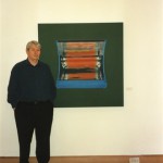
- Tim Mara standing beside his print ‘Two Bar Electric Fire II’ in the Glasgow Print Studio Gallery. The exhibition ‘Tim Mara- A Slightly Obsessional Printmaker’ ran at the Glasgow Print Studio Gallery from 31st May until 28th June 1997.

-

- Tim Mara – Two Bar Electric Fire 1995/1996

Two Bar Electric Fire 1995/6
Previously Tim had combined objects in pairs, this was one of his first attempts to create an artwork form an individual isolated image. What happens when the object is isolated in this way?
If you compare the first of Tim’s key works ‘Mirror Man’ produced 26 years earlier his work seems to have changed dramatically. What developments and elements can you identify in his work, which link these, two pieces?
Tim felt that the format of this work and the use of a large canvas substrate gave the work an incredible status and scale, do you agree? Is the print monumental in feel?
He felt that the choice of object and the fact that it was not too individual was important, why do you think this was important to him?
The colours used in this print suggest an interest in naturalistic representation. Do you think Tim was interested in this? What other interests may have been inspiring him in this work? How is colour used?
The object here is placed on the canvas background in a very deliberate specific way. If it were placed elsewhere in the picture plain how would the image be affected?
Is this a painting or a print?
Mara died in 1997.
Mervyn Peake London Fantasy
Born in China 1911, died 1968.
Excerpts from Peake’s prose London Fantasy were used in Roger Taylor’s London Town C’mon Down song.
But for the fact that the eye can cease to respond, the brain to absorb, the heart to miss a beat, the spirit to launch itself on a hazard of speculation, then surely, in the weird creatures that make up this dark hive called London, or for that matter the world, there would lie before us every day such a scene as haunts the brains of madmen, a delirium of heads and frames and hands, a cavalcade hardly to be suffered for the very endlessness of its inventive fantasy….
Clay miracles float by in a hundred lights. The eyes in constellations swarm through London. Sight becomes cluttered. There is no end to it.
Beneath the electric glare; in fog; in sunlight, in firelight; in wind, at sunrise or at dusk, there is no end.
Source: World Review, August 1949, New Series No.6, pp.55–59,
prose poem, ‘London Fantasy’ (illustrated).
Reprinted without the illustrations (!) in WD, p.78.
Reproduced from World Review, with illustrations, in MPR 16:11–15, and again in PS Vol.9, No.iv, pp.3–7.
-

- Mervyn Peake


